
Welcome to my archive of hand lettering.
I've been practicing hand lettering for about ten years now, to varying results. I take a lot of inspiration from the late 19th and early 20th century, and try to emulate the engraved and lithographic look of the era digitally. Even with really nice, modern typefaces that emulate that kind of typography that I opt to use for quick results, nothing beats really thoughtful lettering. Not everything demands the engraved aesthetic, of course, so quite a bit of my work doesn't feature that element. I don't have formal training in this department, but it's so much fun to do anyway.
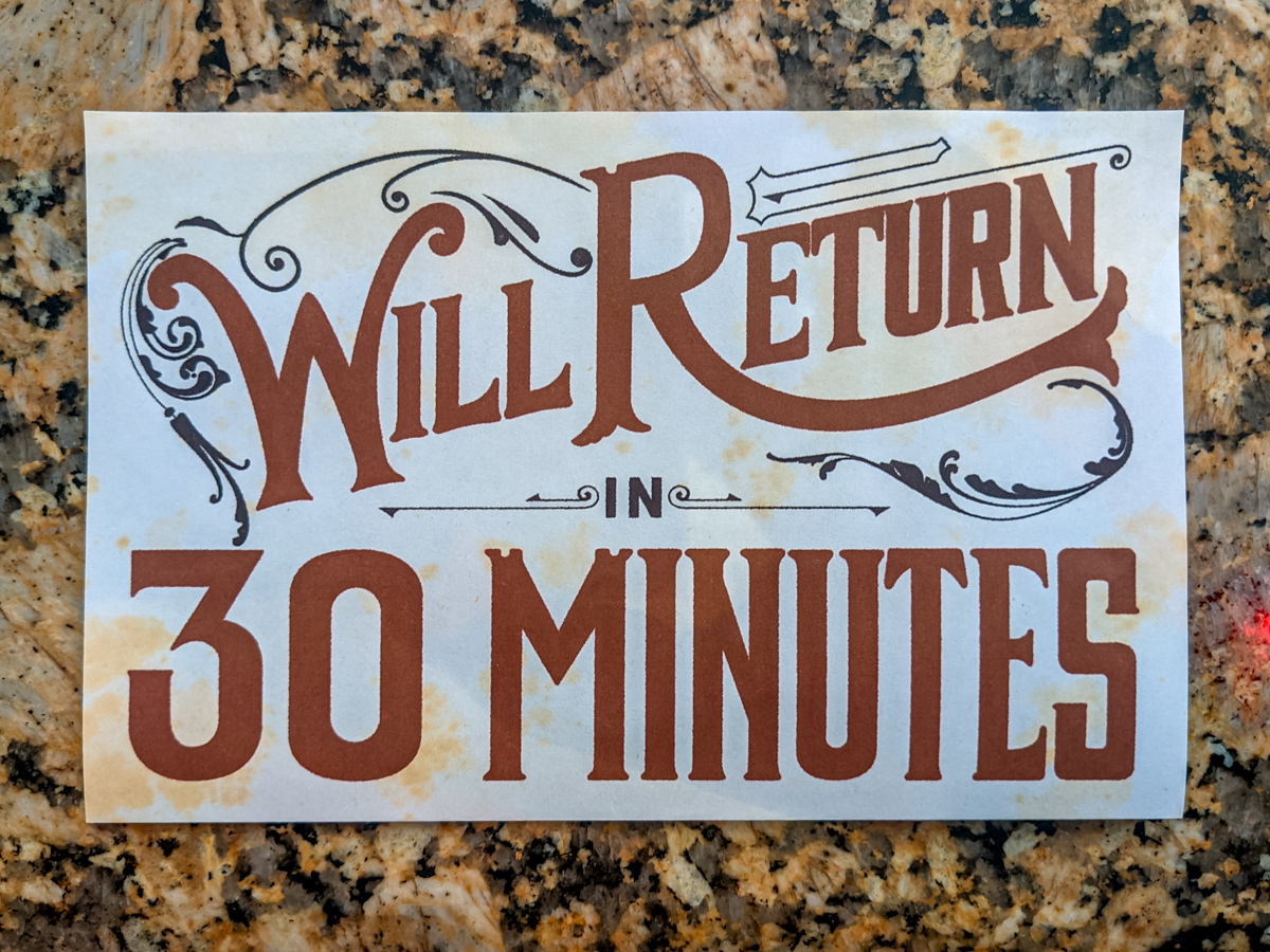
We were in need of a lunch break sign at one of the Mountain Room Escapes Locations, and I felt my time would be well served by hand lettering this sign. THe original was done with graphite and Sharpie because we didn't have a printer there, this digitized, cleaned up, and printed version came later.
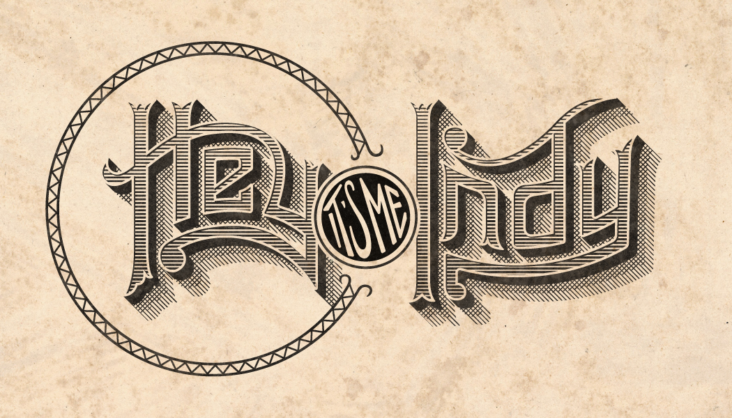
This is an update to my 2018 "engraving" that served alongside my old 2016 1880s monogram, in fact, it's on the reverse side of my business card. It even uses the same circular frame from my monogram. Inspired by the letterforms on old engraved business letterheads, it's a sort of juxtaposition between such over-the-top lettering and such a casual greeting from me, Indy. Hey. It's me.
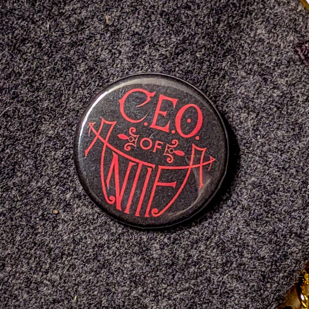
I made the ANTIFA button on a whim because I really wanted to letter something 1890s, and conservatives were getting their panties in a bunch about ANTIFA, and they always assume it's an organization with some sort of hierarchy, so I made this button design declaring my own status as the CEO. (Or anyone who decides to wear it.)
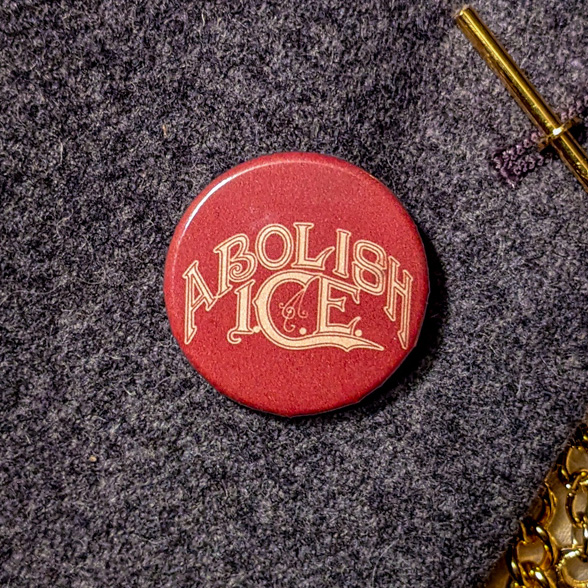
The ICE button feels so old now, but also feels even more relevant today (2026), but yet another job I did because I felt politically motivated to do so. More 19th century inspiration because I thought it was eye-catching.
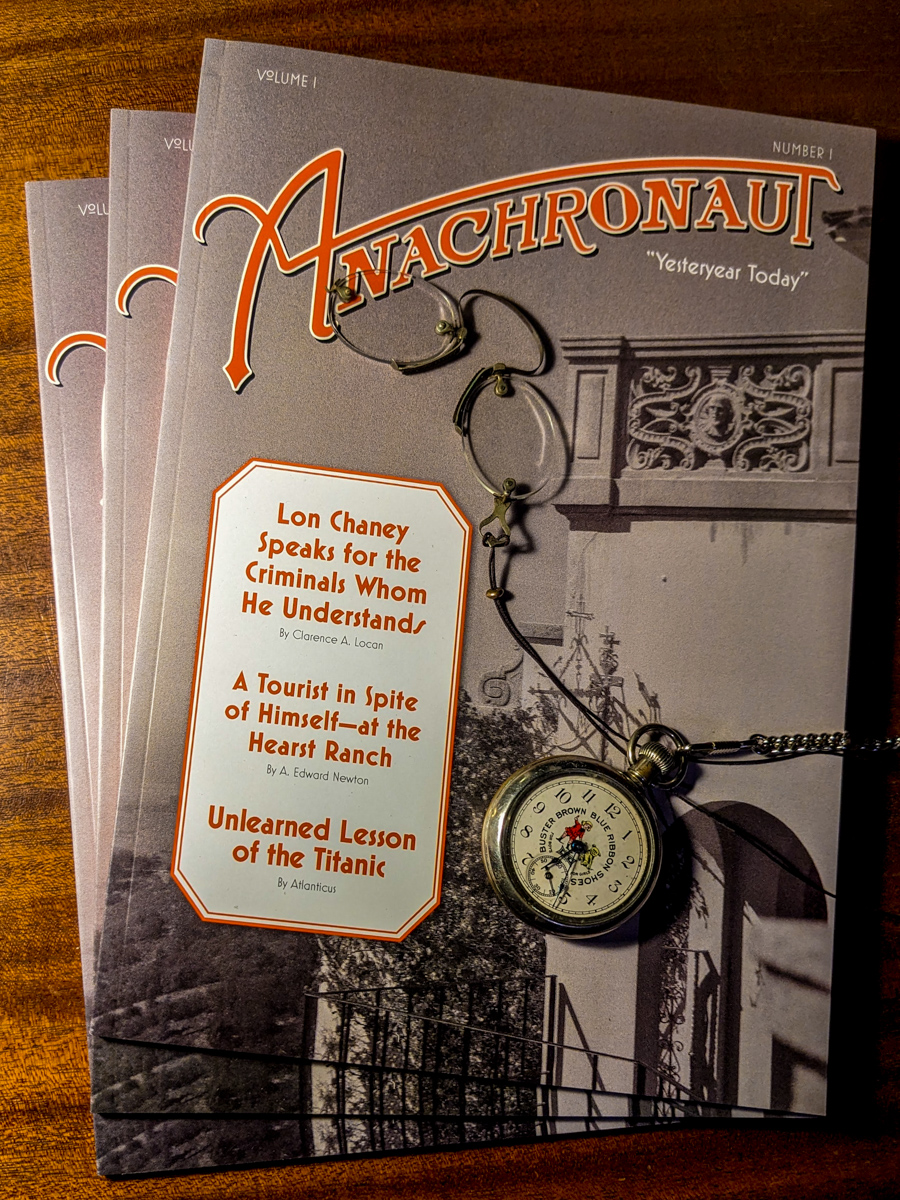
The Anachronaut is a time traveler's monthly, and this masthead was created to evoke typography of the 1930s. The magazine is dedicated to reprinting articles from the past about just about any topic so as to serve potential time travelers who wish not to appear out of place when visiting the past. One would not like to stand out in a crowd because they didn't know about the latest Lon Chaney film.

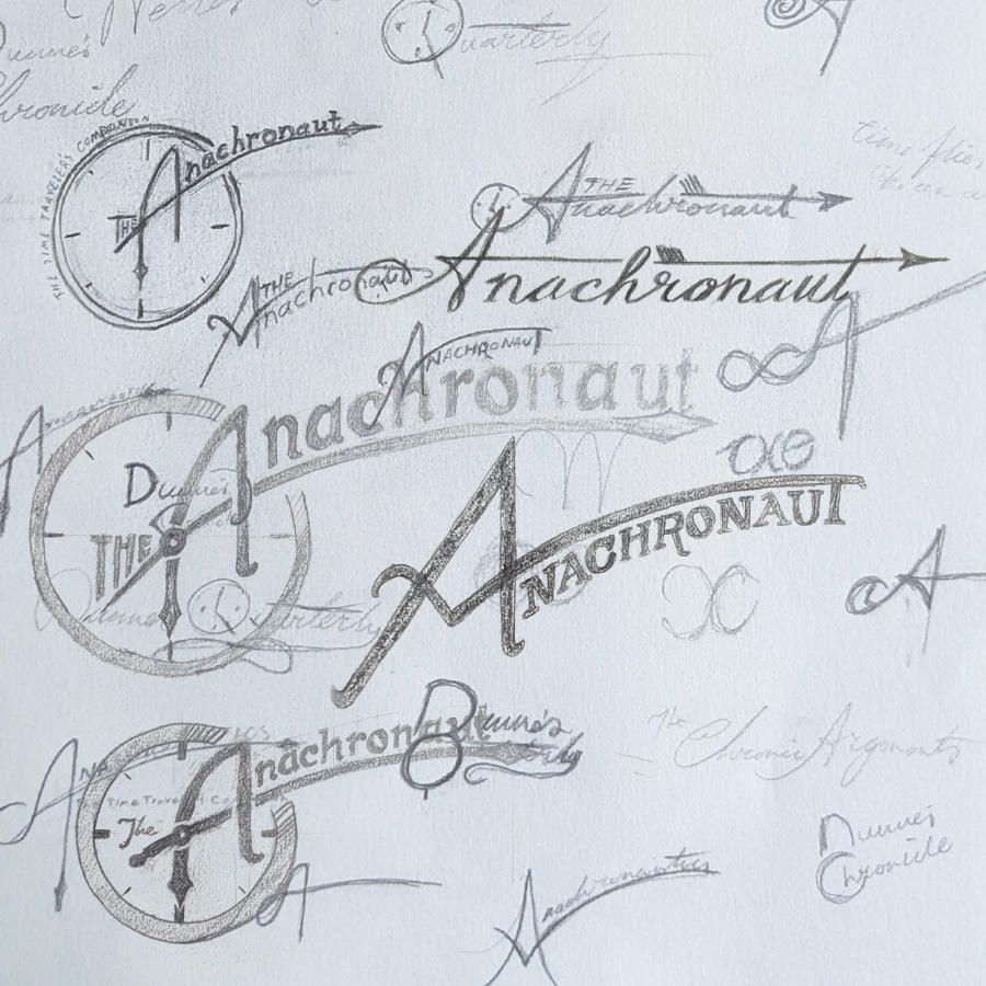
The masthead for The Anachronaut was based on 1930s typography. Countless thumbnails were drawn up, exploring my own handwriting and the relationship between letterforms and the context of the magazine. After deeming the version with the clock was too on-the-nose, the "A" was taken and applied to the masthead I liked the most.
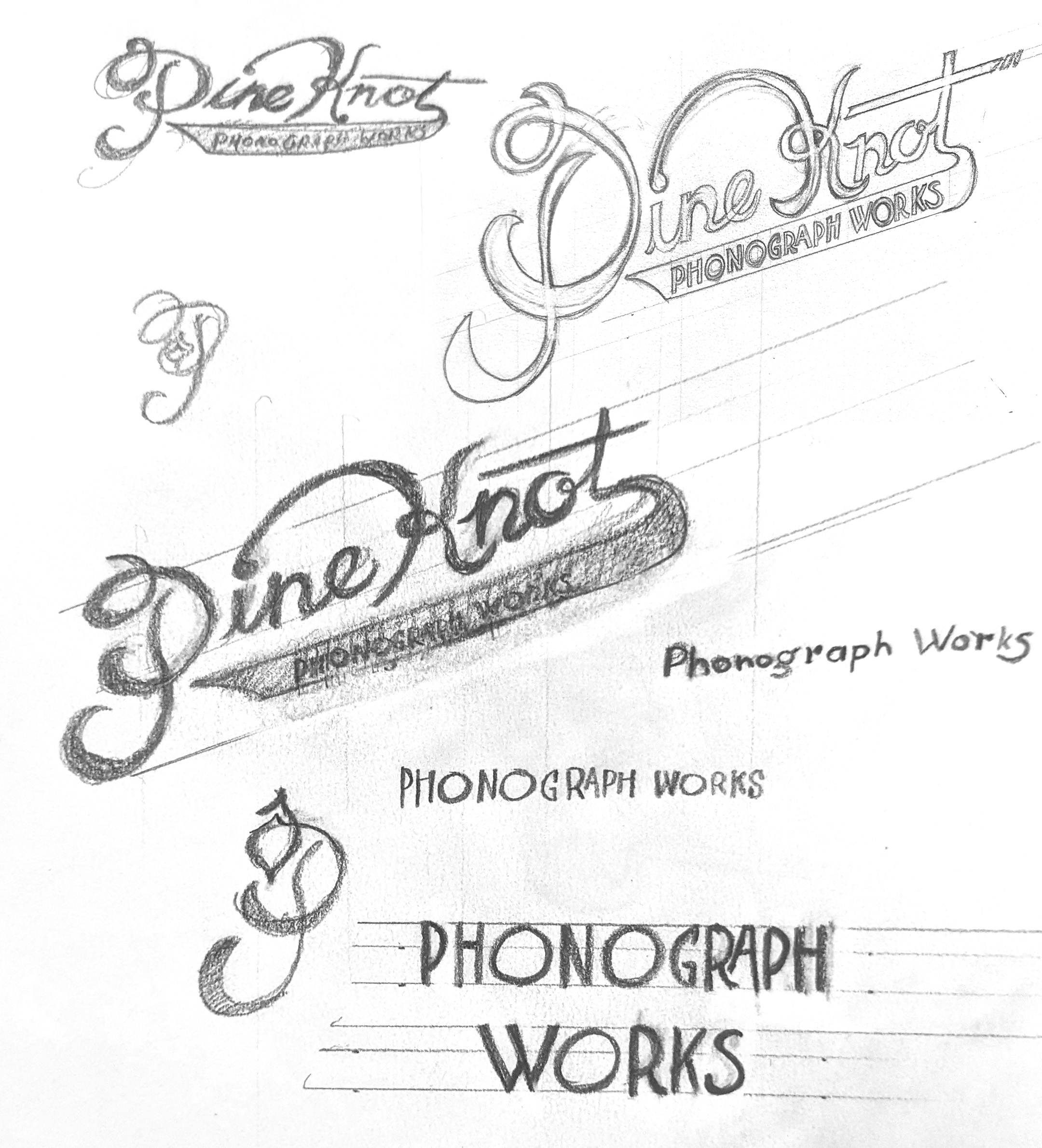
The Pine Knot Phonograph Works logo is based on the typography if 1920s advertisements and phonograph related logo design. "Phonograph Works" is based on the type used on department headers in Talking Machine World, a phonograph trade journal, while "Pine Knot" was based a little on my handwriting and exaggerated to look like calligraphy.
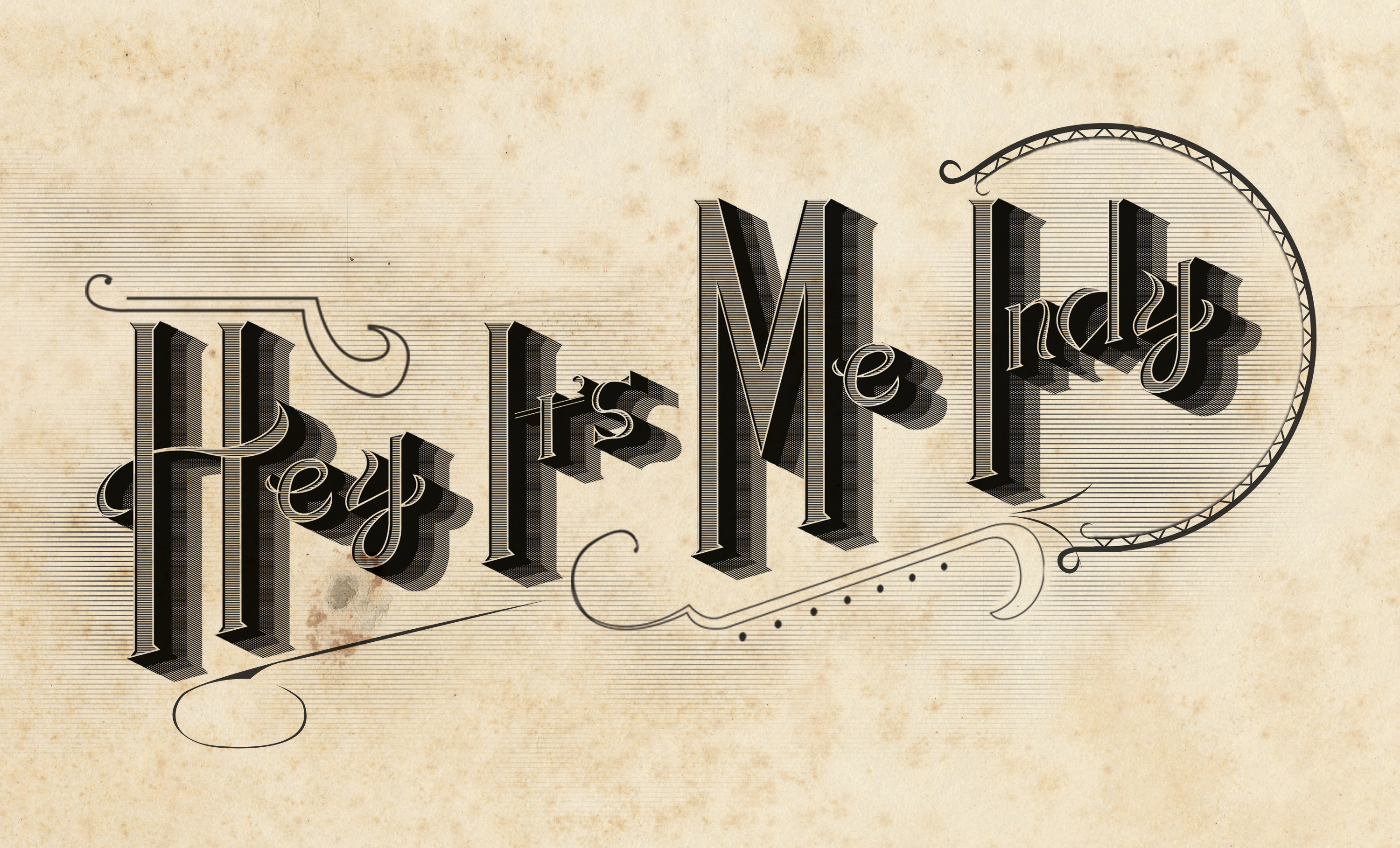
This one was done One Million Years ago and has long since served as a sort of secondary logo to my 1880s I.P. logo, in fact, it's on the reverse side of my business card. Inspired by the letterforms on old postcards and engraved business letterheads, I combined the two to make this. A sort of juxtaposition between such over-the-top lettering and such a casual greeting from me, Indy. Hey. It's me.