
Welcome to my archive of logos and branding.
Just what it says on the tin, all thing branding and logo related. Color systems, package branding, and anything related. I try to incorporate hand lettering where I can, and creating systems of hierarchy using color satisfies my need to structure.
As a result of my need to try to use hand lettering where I see fit, there is some overlap between some of my branding work and my lettering work in my archive. Hopefully it doesn't feel too repetetive. Hopefully, you appreciate seeing my very lovely work multiple times.
So nice you see it twice.
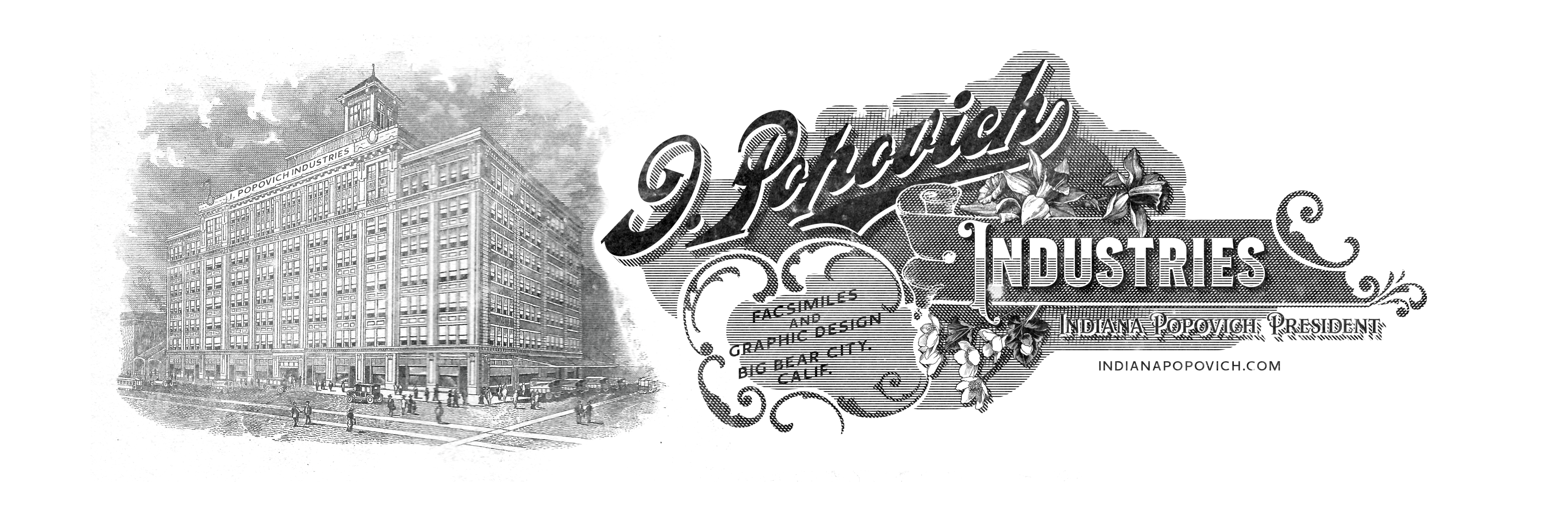
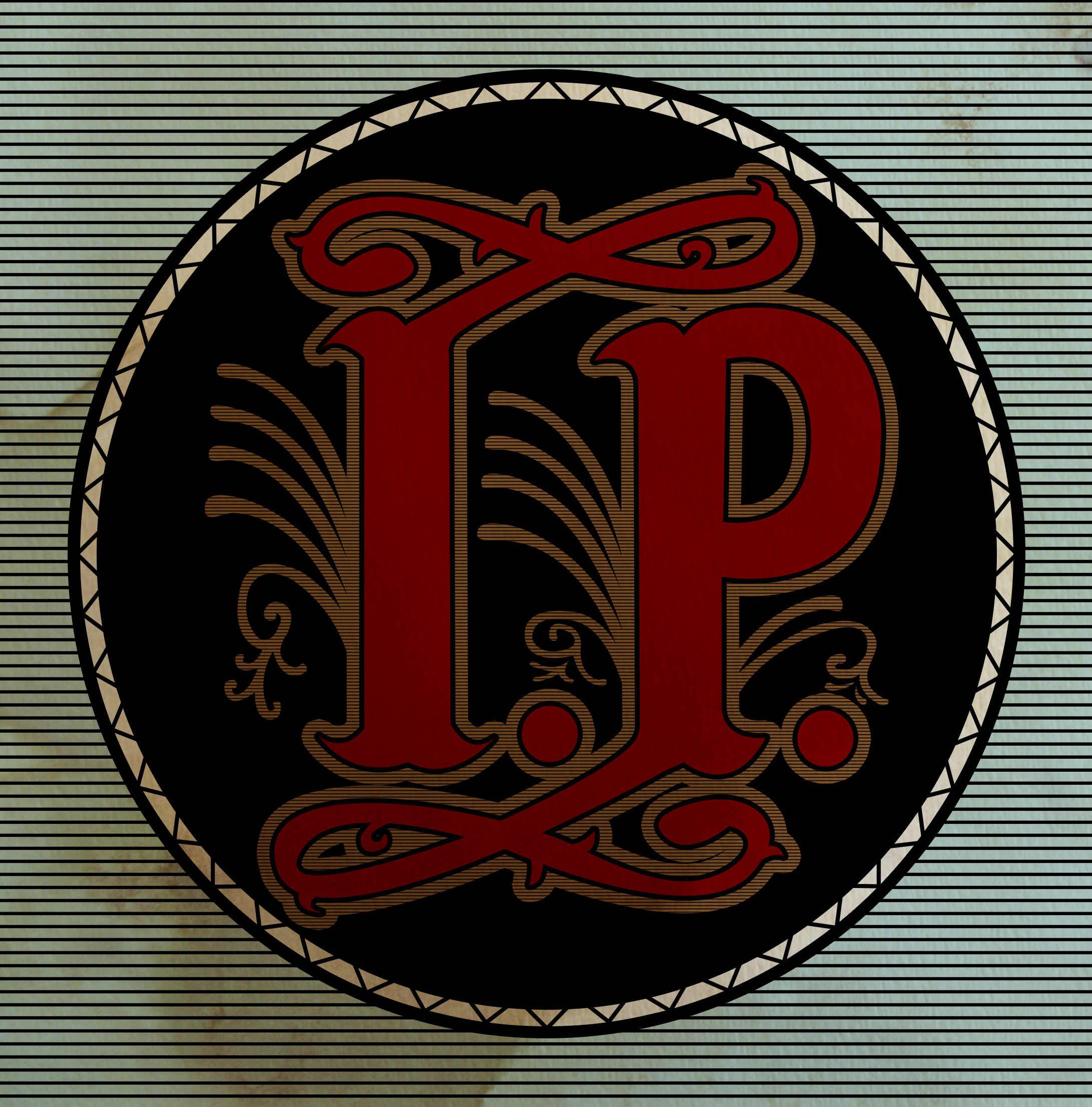
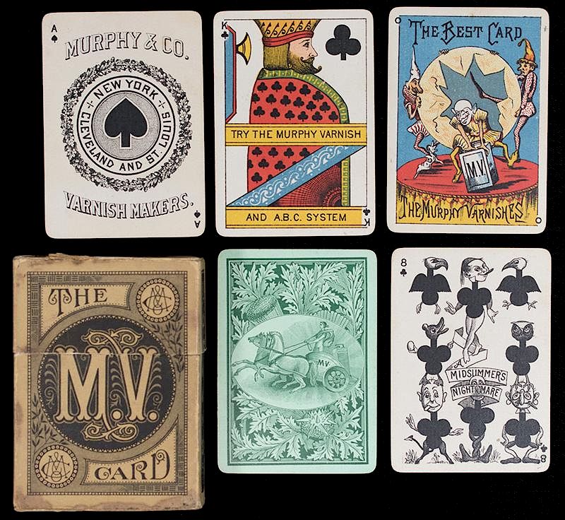
Based on the 1880s Murphy's Varnish playing cards logo, a version of this monogram has been my logo since 2016 because I refuse to let it die.
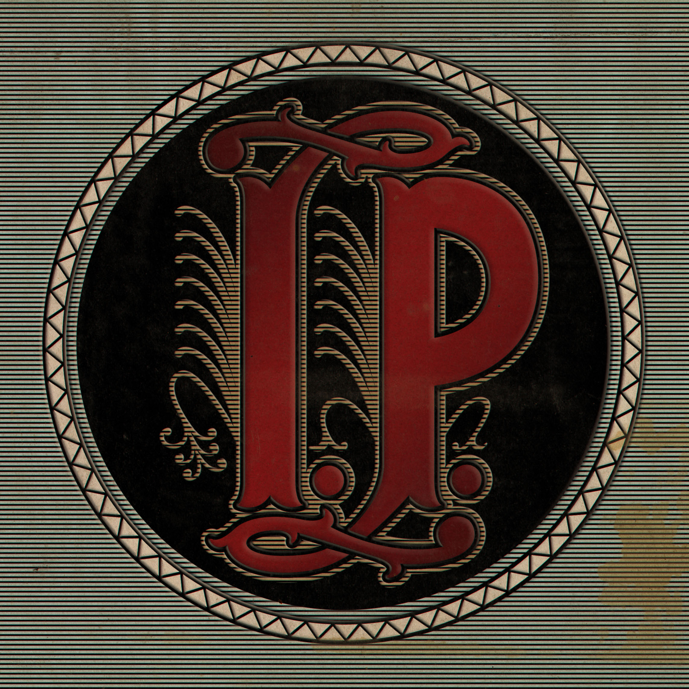
For the tenth anniversary of the original logo, I decided to redraw it from scratch—almost from memory—and created both this dimensional version and a flat version. The repetetive decorative elements that jut out of the letters number seven in total, representing the letters in "Indiana" (that's me).
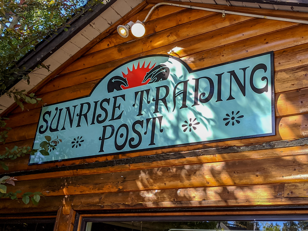
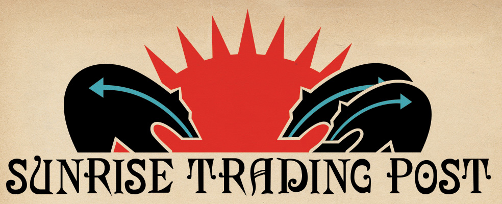
Logo and typography for Sunrise Trading Post in Big Bear Lake. As a store selling Native American jewelry and other goods, the logo is based on traditional southwest Native iconography, with the three bears representing the owner and her family. The typography is based on type from the 1890s and evokes a bit of the old west.
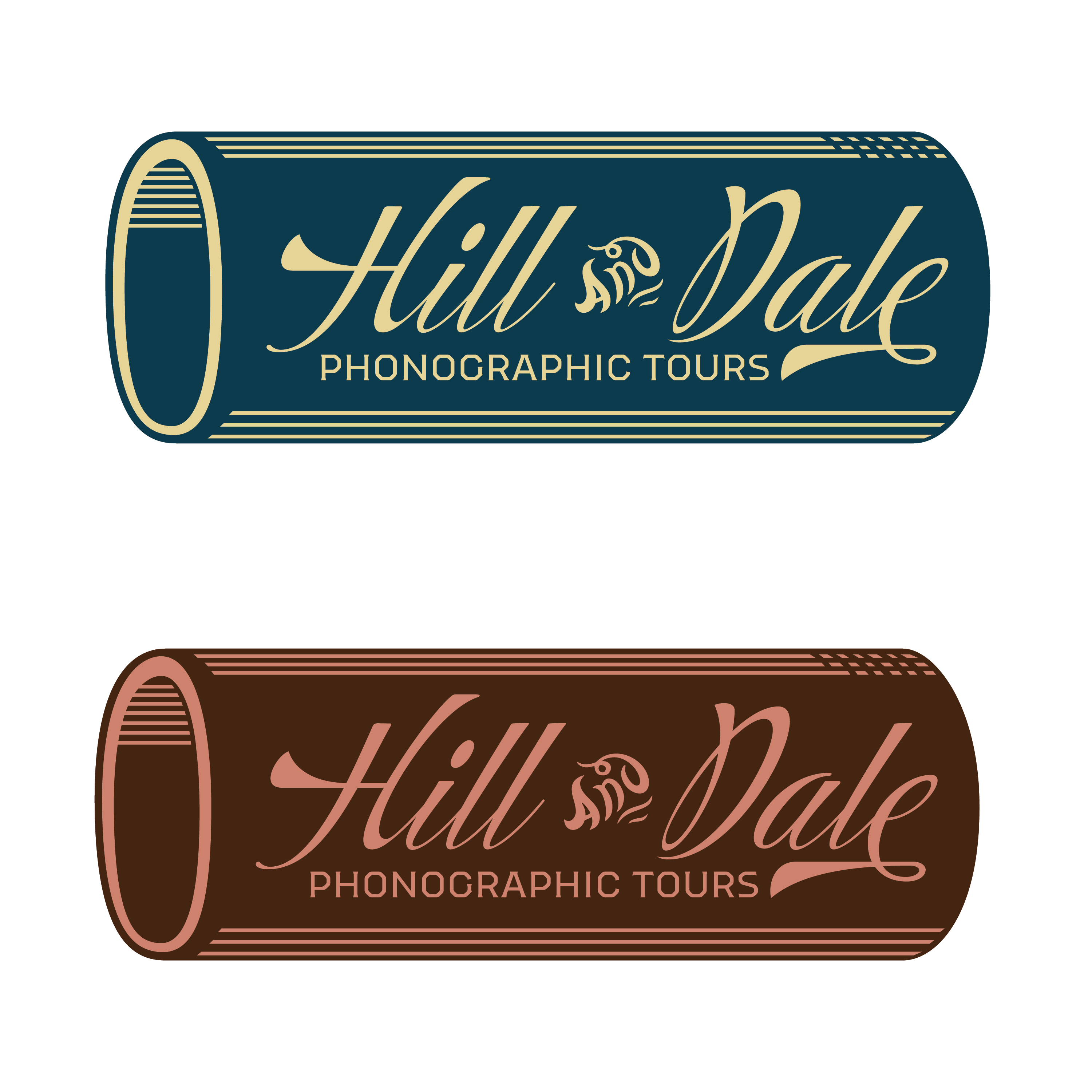
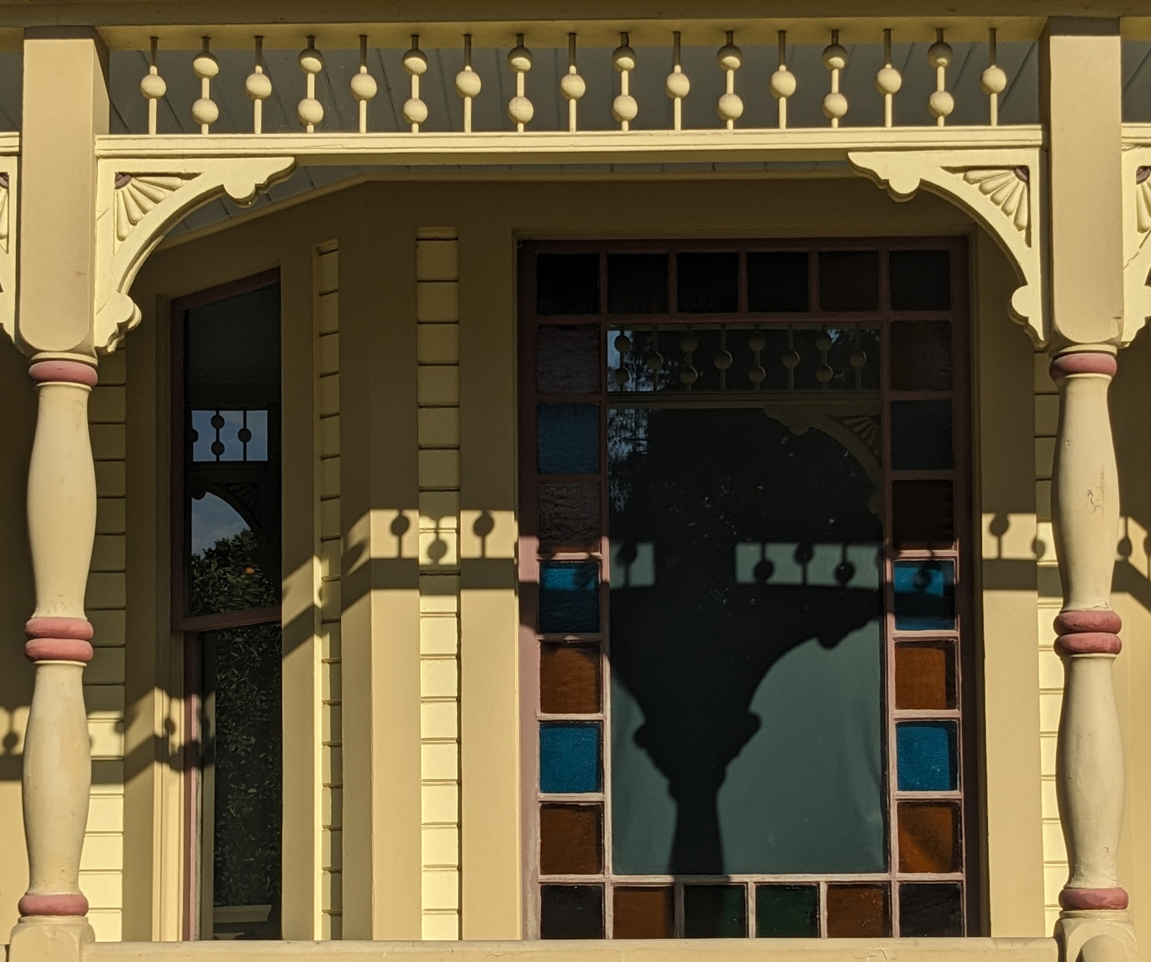
The Hill and Dale logo took inspiration from the typography of the early 20th century. The brand concept was that of a company that offers tours of places through sets of wax cylinders, and cues on a map to designate when a particular cylinder should be played. The logo itself, of course, takes after the shape of a wax cylinder and uses the colors from the CSUF Arboretum's Heritage House (above), as the imagined wax cylinder tour takes users through the Arboretum and proceeds would benefit the house's restoration.

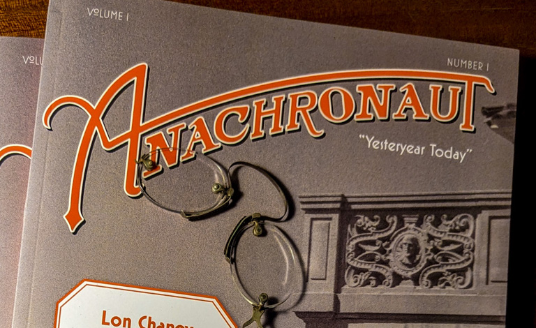
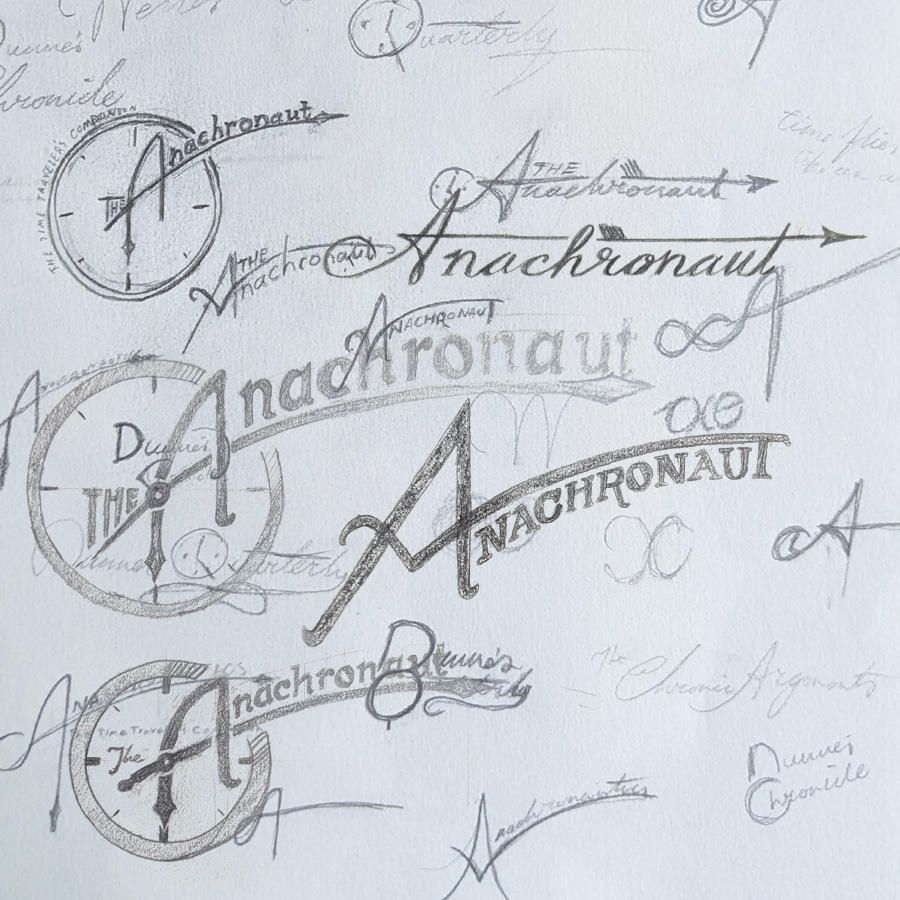
The Anachronaut is a time traveler's magazine, and the masthead was based on 1930s typography. Countless thumbnails were drawn up, exploring my own handwriting and the relationship between letterforms and the context of the magazine. After deeming the version with the clock was too on-the-nose, the "A" was taken and applied to the masthead I liked the most.
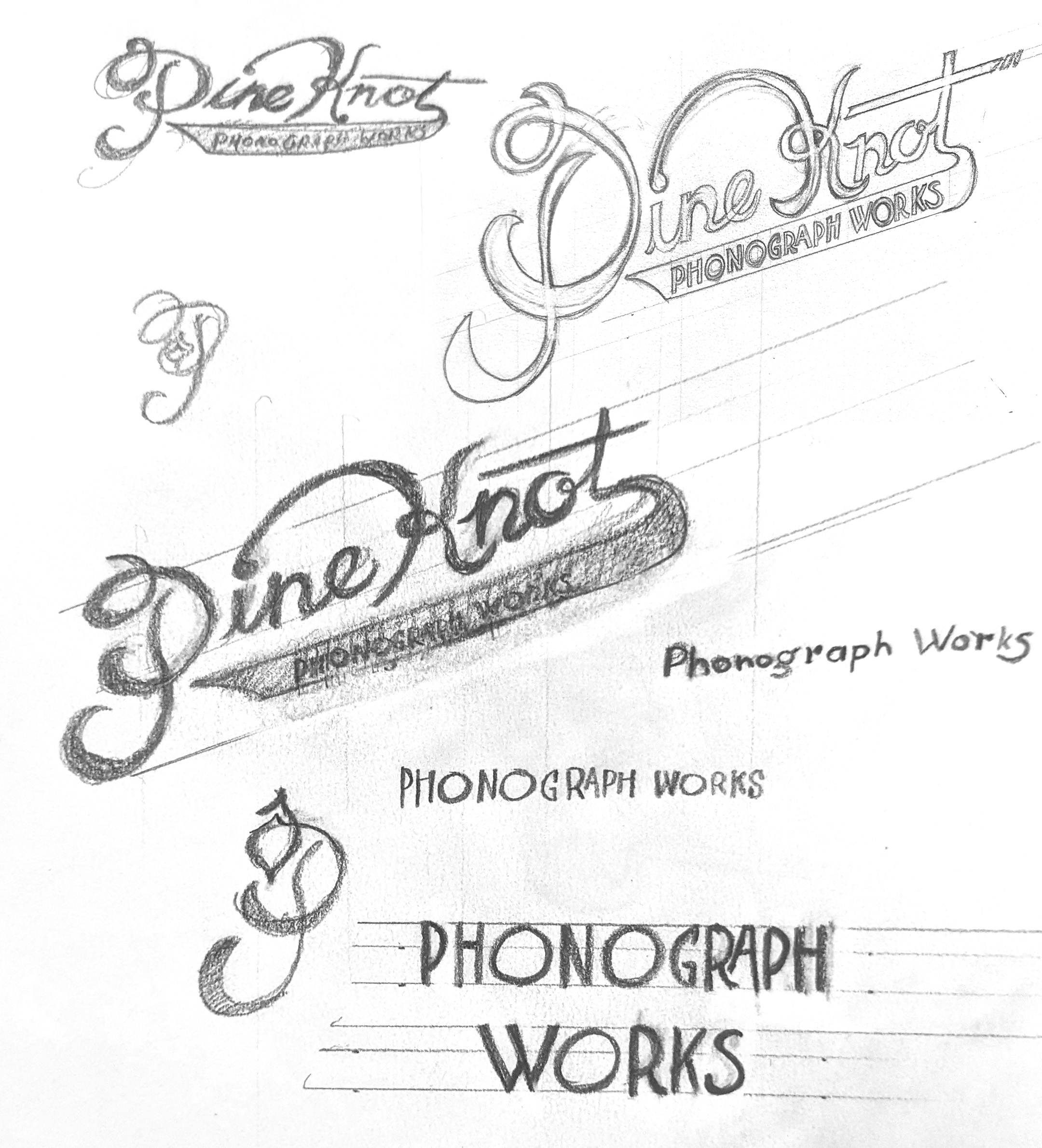
The Pine Knot Phonograph Works logo is based on the typography if 1920s advertisements and phonograph related logo design. "Phonograph Works" is based on the type used on department headers in Talking Machine World, a phonograph trade journal, while "Pine Knot" was based a little on my handwriting and exaggerated to look like calligraphy.
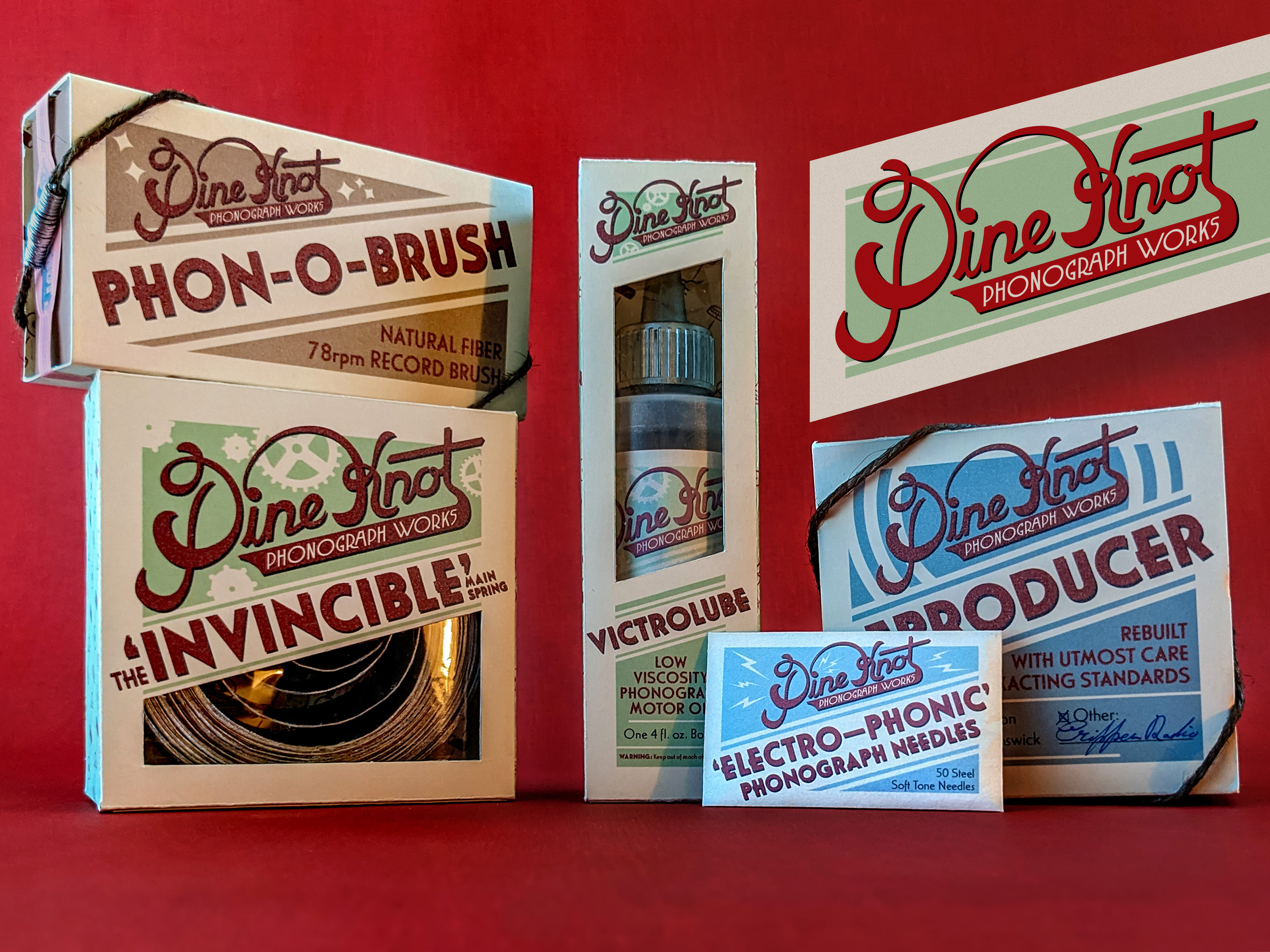
The Pine Knot Phonograph Works sells different products necessary to the continued function of antique, wind-up phonographs and records. I developed a color system denoting which products serve what function for repeat consumers to identify different products more easily. Green is related to the mechanics, blue is related to sound, and brown is related to record care.
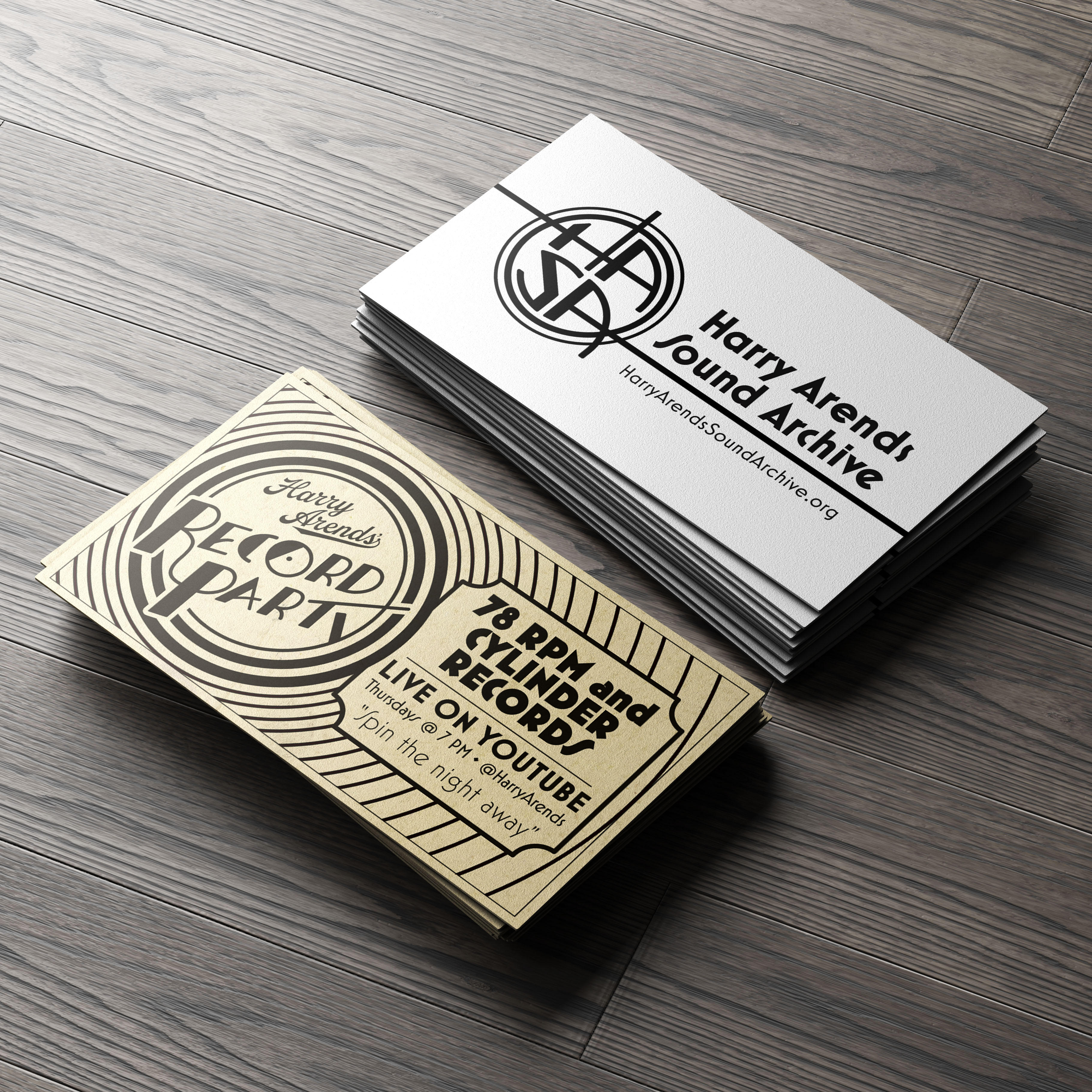
Business cards for Harry Arends' Record Party and the Harry Arends Sound Archive—Harry has a large collection of recorded music from the 1890s to the late 1950s. Both the Record Party and HASA logos were made to represent that period of time. The Record Party is a live show on youtube showcasing music from that period, so the logo needed to be agnostic of a specific decade, but fit define the era as a whole. The HASA logo is more of a blending between the past and future, with its Art Deco style and modern sensibilities.

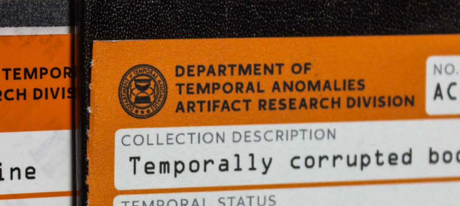
Designed for a set of time travel related books, this appears as both a seal on what look like government documents and as a rubber stamp. The inverted hourglass with rising sand is meant to convey traveling against time, and the style of the logo evokes that of a government agency.
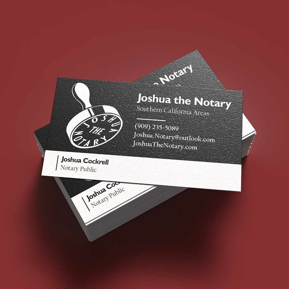
Designed in 2020 for a coworker who had a notary business on the side, two versions were created for use on a black background and one on a white background. Here, the logo (mine) was applied to his business card (not mine), and using the vector file he had a couple of shirts and a hat embroidered as well.
The original version of my current logo, used an existing font and modified it as I saw fit to mimic the style I was going for.
Based on the 1880s Murphy's Varnish playing cards logo, I made this One Million Years ago and have since updated it.